There has certainly been a trend recently of using animations to elevate user interfaces and improve user experiences, and the more subtle versions of these are known as micro animations. Micro animations are an understated way of adding a little bit of fun to everyday user interactions such as hovering over a link, or clicking on a button.
In this tutorial, I will be showing you how to create your own animated button completely from scratch. You won’t need any sort of developer setup to follow this guide as we will be creating it within the browser in Codepen. Just a basic knowledge of HTML and CSS would be great. Also, it’s good to note – if you get stuck at any point, you can view the finished product here to help get you back on track.
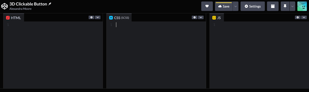
So, as just mentioned, we will be starting off in Codepen. Head to codepen.io in your browser and (if you do not have one already) create a new account, otherwise sign in to your existing account. Then if you look to the sidebar to your left, you should now be able to create your own pen. Once you have done this, you should see three empty containers: one for your HTML, the second one for your CSS, and the third (which we won’t be using today) is where your JavaScript would live.
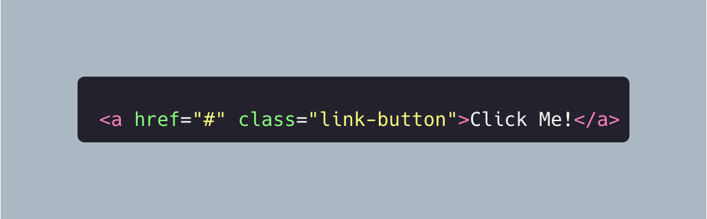
Brilliant, we are now ready to start coding. Let’s begin in the HTML box and create the element that we will later style. Interestingly enough, instead of choosing a button element, we want our styled button to send us to another page when clicked, so instead we will create the <a> link element. Type the following code into the HTML box:
I’ll briefly explain the attributes that we are passing to this link element. The href=“#” attribute tells the link that we should stay on this page when clicked for now. That way we can test that the animation is working as we want it to. You can always change this to another URL at a later point if you so wish. The second attribute is class=“link-button” and this will help the CSS to target this HTML element, so we can style it to look like a button.
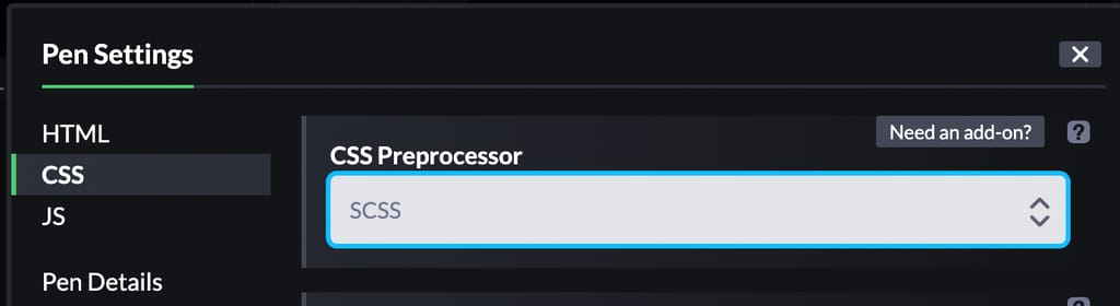
So now the fun begins, the CSS styling. We are going to be adding the SCSS preprocessor to this project, as it will allow us to neaten up our code by nesting our selectors and adding variables. To do this, click on the little cog settings icon within the CSS section, right next to the downwards arrow. This will open the pen settings pop up and within the CSS preprocessor input box, select SCSS. Then click on save & close. You should now see (SCSS) next to the CSS title in the section tab. We are now ready to begin styling.
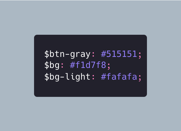
Let’s start by setting some colour variables. Add these three lines of code to the CSS section:
The first two we will be using to colour parts of our button. Don’t worry too much about the third for now, I will cover what we will be using this for later.
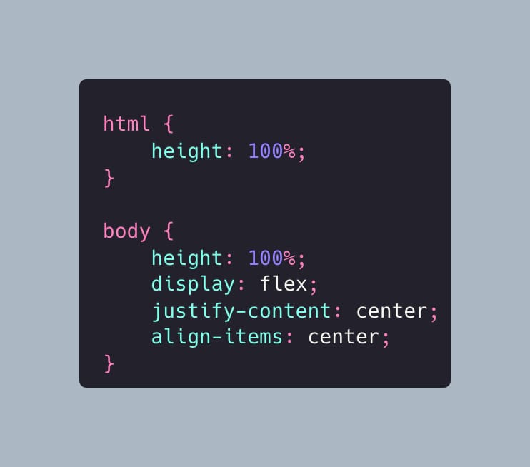
We will now declare some base styles for the container, to make sure our button is front and centre, add the following body and html styles to below our newly defined variables within the CSS section:
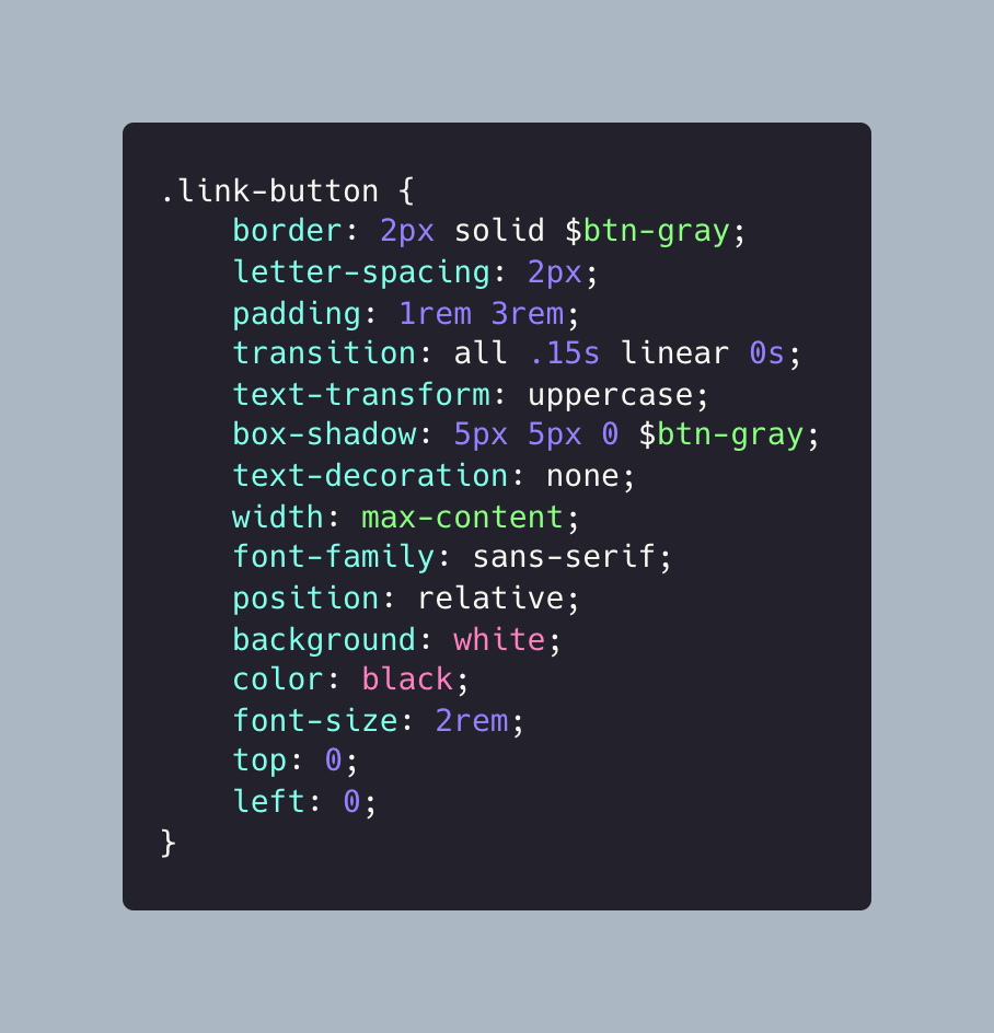
Now that we have our base styles set up, we are ready to begin styling the button. Type out the following styles underneath the body and html styles we just added:
Some of these styles (like text-decoration: none) undo some of the inherent link styles by removing the underline below the text. Others (like border: 2px solid $btn-gray) add the outline around the element to make it look more like a button.
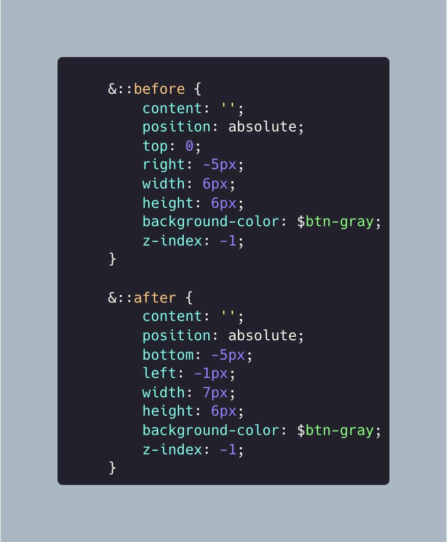
Now it is starting to take shape, but it is still looking very two-dimensional, so let’s work on adding the third dimension. We will do this using the ::before and ::after pseudoselectors. These will add little ghost elements to the DOM, before and after the element they are added to. So let’s create a new line just below the left: 0 line, so that we still have the closing bracket underneath. There, add the following code:
We should now see some thicker borders on the right and the bottom of the element, to give it the 3D effect. However, when we click on this, nothing seems to happen. Either the button is jammed, or we haven’t added any animation to it yet. I’m leaning towards the second of these two possibilities!
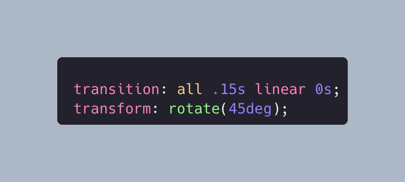
So let’s go ahead and add that animation. We will be using the CSS transition and transform properties to adjust the position of both the main and the pseudo element. This will give the illusion of a pressed button on the click event. Let’s add both of these transition and transform lines of CSS to within both the ::before and ::after selectors, like so:
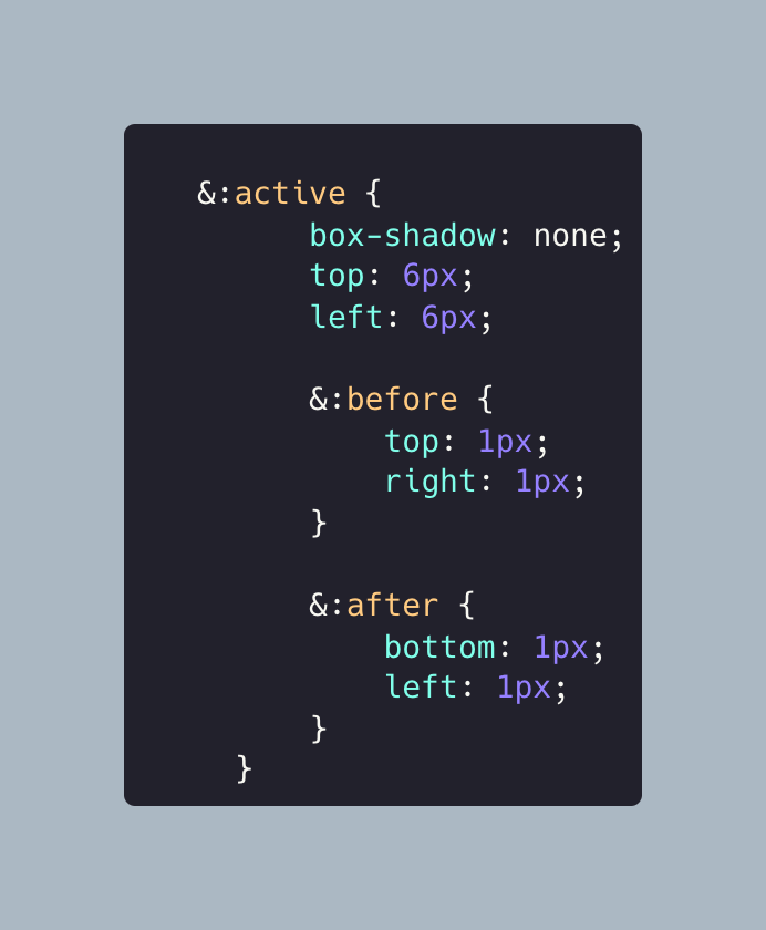
We also have access to the :active pseudoclass, which is applied when the button is clicked. So we should now add this block of code to the end of our existing CSS, just above the final closing bracket:
These styles just tweak the position of the elements when the button is in that aforementioned ‘clicked’ state. Now when you click on the button, it should give the illusion that it is a 3D button that has been pressed down on. But I think we can go one step further with this 3D illusion.
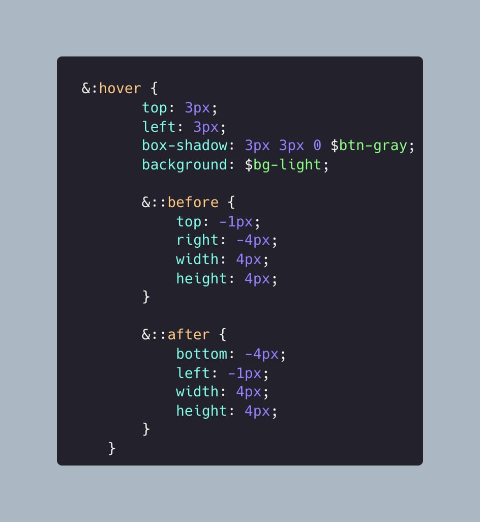
Let’s give our button a hover state, where it appears to pop out even further when a user’s mouse hovers over it. Add the following lines of code to just above our :active block:
Here, we are using the :hover pseudo selector to reposition the elements, and give this extended 3D effect on hover. Our 3D button should now have three different states: default, hovered and active (clicked).
As a nice little extra, let’s decorate the container that our button lives in. This is where that $bg variable that I mentioned at the start comes into play. Add the following styles to within the body selector, underneath the align-items: centre style:
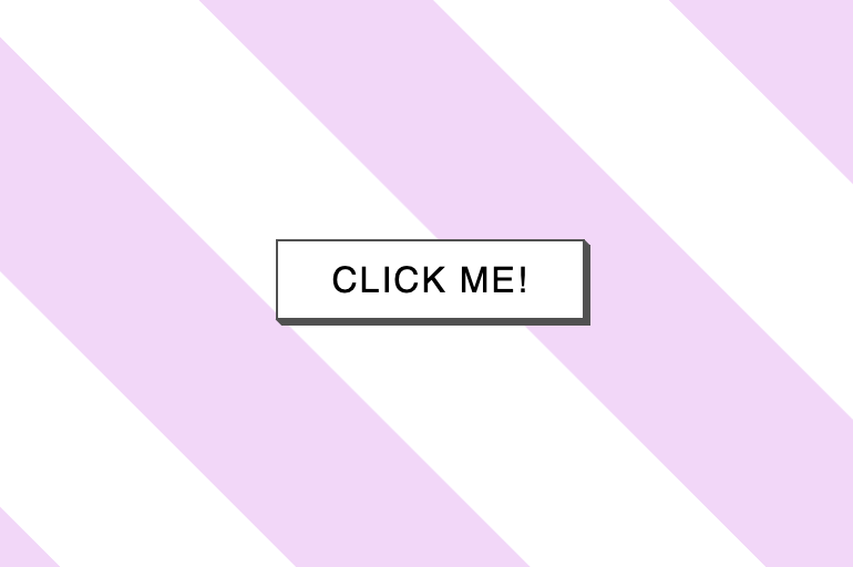
This will give us some eye-catching pink diagonal stripes running across the entirety of the background. If you want to change the light pink colour to another, just amend the colour hex code that we set at the start with the $bg variable.
So well done you! You have just made yourself a 3D button completely from scratch. If at any point you missed a step or got a bit stuck, you can see my example pen here, with all the code you need to get you back on track. You now have a great base element to customise as you wish, and integrate into your own project.
4min read On 13th August 2026, a storm knocked out cooling at RadiusDC’s Phoenix data centre, which hosted essential Namecheap operations. To protect hardware from thermal damage, Namecheap took services offline while temporary chillers were brought in. The incident and recovery ran for roughly 30 hours, with Namecheap’s own site unreachable for about 11 hours 42 minutes
3min read On Wednesday 19 August, Monzo had an outage. DownDetector logged more than 3,000 reports by midday. Monzo’s own statement was direct about what it did next: it activated Monzo Stand-in, its fully independent backup bank, while it investigated an issue affecting customers. By the end of the day, Monzo said the issue was resolved and
3min read GitHub’s incident on 17 August 2026 ran from 13:28 to 21:15 UTC, seven hours and forty-seven minutes. At peak, web and API traffic saw error rates of around 20%, while archive and raw-content downloads reached roughly 50%. SAML and OIDC authentication, SCIM and Team Sync were affected alongside Git operations, Actions, Pages, Issues, Pull Requests
3min read Adding a new website, launching a customer portal, or handing a service to a new team should be straightforward. Setting up monitoring is part of that job, but it is easy for a manual step to be missed when information is spread across several systems. StatusCake now integrates with viaSocket, giving teams a way to connect
7min read A website may be standing and still be in trouble. It may answer a request, return a cheerful 200 OK, and yet load slowly enough that visitors begin to lose patience. Its certificate may be nearing expiry. Its domain records may have changed. A server may be filling its disk in the background, patient and
6min read StatusCake tells you that something might be broken. Hermes can check whether it really looks broken, decide who should hear about it, send the email, and keep the record for tomorrow morning’s summary.
Daniel
May 13, 2026
Sign up for the StatusCake newsletter
Want to know how much website downtime costs, and the impact it can have on your business?
Find out everything you need to know in our new uptime monitoring whitepaper 2021