Page speed monitoring that keeps your website fast
Load speed is crucial. Stay on top of yours, keep customers and drive revenue with StatusCake Page Speed monitoring.
Website load speed affects your whole brand
Page load speed changes your customers’ behaviour. A potential customer chooses whether to jump off your site and onto a competitor or stick with you and convert.
If your page load speed is slow, your competitors are more than ready to nab customers from you with a quicker page load. That’s not all. SEO is hugely impacted by slow page load speed which means your ranking significantly drops.
PAGE SPEED TRACKING
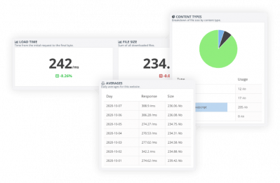
Track how quickly your pages load
Use our Page Speed Monitoring tool to test the load speed of as many individual pages as you like. You’ll get a full breakdown measured in milliseconds to help you identify any problem areas.
PAGE SPEED REPORTS
Get reports on your page speed
Observe and analyse page speed trends across time by creating reports on your page speed tests helping you to make decisions on your webpages, content and code.
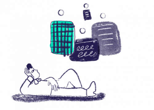
Enter the pages you’d like to monitor along with their thresholds and alerting methods and get all the data you need to create a faster, better experience for your customers. It couldn’t be easier.
With paid accounts, you can choose where your page speed tests are run from. So if your website runs slow in the UK but not America, you'll know about it. Page speed monitoring that works across the world is one that you can rely on.
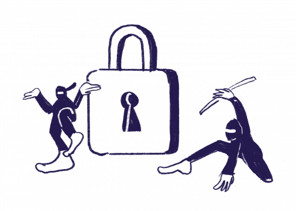
Online security is more important than ever, and that’s why we’ve made it our mission at StatusCake to ensure our customers’ accounts are kept safe & secure on our platform.
To help this further we’ve recently released Google Single Sign On! The biggest plus point? No more pesky passwords to remember! The cherry on top is that Google SSO is available for ALL of our customers.


