
Want to know how much website downtime costs, and the impact it can have on your business?
Find out everything you need to know in our new uptime monitoring whitepaper 2021


If you’re a website owner, manager, or developer, you know to always check your website’s performance and design on both desktop vs mobile, especially since Google’s big drive for mobile-first. Google has even centred their 2021 Core Web Vitals around making sure that your website is efficient on mobile.
Google had a good reason to be pushing us to make sure our websites were mobile-friendly since it’s estimated that 61% of customers in the US now land on a website through a mobile device.
So with all of this focus on making sure your website:
“The market share ratios of those OSs are Android 47.51%, iOS 41.97%, Symbian 3.31%, and Windows phone OS 2.57%. There are some other mobile OSs that are less used (BlackBerry, Samsung, etc.)”
According to sciencedirect.com
What are some of the fundamental ways that your website can change depending on the mobile and browser?
There’s a variety of things on your website that can be impacted depending on what the customer is using to look at your website. For example:
If you’ve optimised your website for mobile and considered a “small screen” in relation to desktop, how do you know “one size fits all”? Your website content isn’t going to automatically fit all mobile screen types meaning you run the risk of vital content like CTAs being missed out/cut out or below the fold on mobile.
One way to check this is by using another of Google’s key tools (are you starting to see a theme here?) which is The Mobile-Friendly Test Tool. Alternatively, if you’re a developer use the “meta viewport” tag in the HTML.
Your website loading time can affect everything from your conversions to your SEO rankings so getting it right on both desktop and mobile is a must. But it doesn’t stop there. You have to make sure that whatever browser someone could be using on mobile is also loading fast (i.e. less than 2 seconds). For example, iOS users tend to use Safari. How does your website load on mobile Safari on iOS vs desktop Safari?
Firstly, check your overall page speed on mobile before you get more granular. If you can see that your website is very slow on mobile in general, you need to fix the significant factors before diving into browsers on mobile devices and which devices at that.
You can check by using Google’s Page Speed Insights which will show you the speed of your website loading, if it “passes” Core Web Vitals, and what areas need to be worked on like LCP.
Once you’ve checked this, you can use Google Analytics to go more granular.
If your website is super responsive on Chrome on desktop, you’re winning! If it’s super responsive on iOS on Safari, you’ve nabbed a large majority of your audience. But what if Microsoft Edge isn’t working on mobile?
Responsiveness is not a given. That is the key thing to remember and the only way you will know if there’s an issue is to test, test, test. If you’re using a CMS system that allows you to pick a “theme”, you should be able to see in its description whether it’s considered responsive across all devices.
Other tips include making sure videos are responsive on mobile, images are compressed, and table data is responsive on mobile.
These are just 3 examples of how a lack of mobile optimisation can affect your customer engagement with your website.
If you want full website monitoring to ensure your website is loading fast, and not continuously experiencing website downtime, sign up to StatusCake for free. It’s genuinely free!
Share this

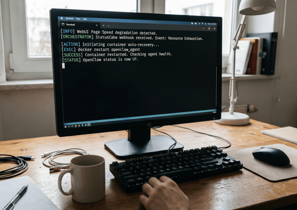
3 min read The allure of OpenClaw is undeniable. You deploy a highly autonomous, self-hosted AI agent, give it access to your repositories and inboxes, and watch it reason through complex workflows while you sleep. It is the dream of the ultimate 10x developer tool realized. But as any veteran DevOps engineer will tell you: running an LLM-backed
7 min read There are cloud outages, and then there are us-east-1 outages. That distinction matters because failures in AWS’s Northern Virginia region rarely feel like ordinary regional incidents. They tend instead to expose something larger and more uncomfortable: too much of the modern internet still behaves as though one place is an acceptable concentration point for infrastructure,
7 min read Artificial intelligence is making software easier to produce. That much is already obvious. Code that once took hours to scaffold can now be drafted in minutes. Boilerplate, integration logic, tests, refactors and small internal tools can be generated with startling speed. In some cases, even substantial pieces of implementation can be assembled quickly enough to
10 min read Whilst AI has compressed the visible stages of software delivery; requirements, validation, review and release discipline have not disappeared. They have been pushed into automation, runtime and governance. The real risk is not that the lifecycle is dead, but that organisations start acting as if accountability died with it. There is a now-familiar story about
4 min read How AI Is Shifting Software Engineering’s Primary Constraint For most of the history of software engineering, the primary constraint was production. Code was expensive, skilled engineers were scarce, and shipping features required concentrated human effort. Velocity was limited by how fast people could reason, implement, test, and deploy. That constraint shaped everything from team size,
5 min read Autonomous Code, Trust Boundaries, and Why Governance Now Matters More Than Ever In Part 1, we looked at how AI has reduced the cost of building monitoring tools. Then in Part 2, we explored the operational and economic burden of owning them. Now we need to talk about something deeper. Because the real shift isn’t
Find out everything you need to know in our new uptime monitoring whitepaper 2021