The web as a whole is constantly evolving and alongside this comes fantastic innovations in how we display content to the user. Some companies are really leading the way when it comes to innovative user interfaces, so in this blog post I will be highlighting a selection of the trends that these companies are pushing forward and how you can recreate them yourself on your own site.
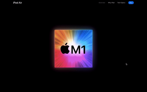
Whenever I think of innovative UI concepts, my first place to look is always Apple. They tend to have new product releases a couple of times a year, and to showcase these new products they always have a fun, creative webpage to show the primary features. At the time of writing this post, their brand new, highlighted product is the iPad Air 5. This webpage really has the wow-factor, and this is predominantly down to one big feature of the User Interface – scroll-based animations.
Scroll Based Animations
Scroll-based animations really make the user feel like they are a part of the ‘show’ that is happening before them, as whenever they decide to scroll their window, the next animation is triggered. This has many benefits, such as the fact that the user can then browse the page at their own pace, rather than watching it in video format at a set pace. These scroll-based triggers also allow for a lot more creativity when it comes to designing a web page.
You may notice that Apple plays a lot with depth on this page, giving the impression that some of the elements are almost popping out of the screen, as well as showing some of their products fading off into the distance.
How To
So how can we create these scroll-based animations ourselves? Well, we could try to go alone and give it a go with some JavaScript and CSS wizardry, but this approach could get very complicated very quickly. Luckily, there are some libraries out there to do the heavy lifting for us. My favourite of these is GSAP’s ScrollTrigger functionality. It is super simple to set up and integrate into your existing project, and (as is shown on their intro page here) allows you to recreate any of the scroll-based animations that you see on the Apple site.
Autoplay Video Demonstrations
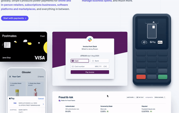
The second trend that I’m noticing a lot more often on sites of development libraries/plugins, are autoplay video demonstrations. One of the sites that I have seen it on (and another great website for forward-thinking design inspiration) is Stripe.
As well as their target audience being possibly less-technical decision makers, you can tell that they are also trying to sell their payments platform to developers, as they have a great autoplaying video demonstration of integrating their service into a project, I am a big fan of this, as a way of providing information in a concise way, as it immediately draws the user’s attention, without needing any extra effort from the user (for instance a click).
One thing to be aware of with this approach is accessibility. Text content embedded within videos can not be accessed with a screen reader, so you need to make sure that any essential embedded content within the video, is also within the HTML on the page. Stripe deal with this in an interesting way. Instead of this content living within a video player, they have actually integrated the content into a <div> container on the page, with everything inside being animated HTML elements.
How To
If the autoplay video technique is something you would like to add to your project (with accessibility considerations in mind), there are some great libraries out there to support you like VideoJS. Alternatively, if you would like to give it a go yourself like Stripe do, then you have tools like TypeIt to animate any text on the page, as if it were being typed out.
Scroll-Snapping
The third and final trend that I have been seeing a lot is scroll-snapping. Scroll-snapping uses the movement of a user scrolling through a page, to ‘snap’ the user’s window to certain content points of a page, rather than the smooth scrolling experience you would normally expect. You can think of it as being like a full-screen vertical carousel.
A company that seems to have adopted this trend and executed it to great effect is Tesla. They have an interesting way of displaying each of the products on their homepage by snapping the user’s viewport to a full-screen image of each of the products, as the user scrolls through the page.
How To
Now, this one we can achieve without any heavy JavaScript library, or even any JavaScript at all. We can do this purely with CSS. CSS scroll snap allows you to determine where the user’s viewport should ‘snap’ to after they have finished scrolling. It also has fantastic cross-browser compatibility, which is always a worry when coming across new CSS features. I’d say that out of all of these UI trends, this one would be the easiest to implement as all the functionality to achieve this is already built into CSS.
Conclusion
All in all, I think this is a very exciting time to be designing and developing websites, as the capabilities of what you can now achieve are pretty much endless. We can see that the majority of the trends mentioned include animation, so hopefully in the future we’ll have a lot less reliance one external libraries to achieve these and a lot more functionality will be built into the native languages. With the evolution of web technologies comes design innovation and generally more fun across the web.
7min read A website may be standing and still be in trouble. It may answer a request, return a cheerful 200 OK, and yet load slowly enough that visitors begin to lose patience. Its certificate may be nearing expiry. Its domain records may have changed. A server may be filling its disk in the background, patient and
6min read StatusCake tells you that something might be broken. Hermes can check whether it really looks broken, decide who should hear about it, send the email, and keep the record for tomorrow morning’s summary.
3min read The allure of OpenClaw is undeniable. You deploy a highly autonomous, self-hosted AI agent, give it access to your repositories and inboxes, and watch it reason through complex workflows while you sleep. It is the dream of the ultimate 10x developer tool realized. But as any veteran DevOps engineer will tell you: running an LLM-backed
7min read There are cloud outages, and then there are us-east-1 outages. That distinction matters because failures in AWS’s Northern Virginia region rarely feel like ordinary regional incidents. They tend instead to expose something larger and more uncomfortable: too much of the modern internet still behaves as though one place is an acceptable concentration point for infrastructure,
7min read Artificial intelligence is making software easier to produce. That much is already obvious. Code that once took hours to scaffold can now be drafted in minutes. Boilerplate, integration logic, tests, refactors and small internal tools can be generated with startling speed. In some cases, even substantial pieces of implementation can be assembled quickly enough to
10min read Whilst AI has compressed the visible stages of software delivery; requirements, validation, review and release discipline have not disappeared. They have been pushed into automation, runtime and governance. The real risk is not that the lifecycle is dead, but that organisations start acting as if accountability died with it. There is a now-familiar story about
James Barnes
April 2, 2026
Sign up for the StatusCake newsletter
Want to know how much website downtime costs, and the impact it can have on your business?
Find out everything you need to know in our new uptime monitoring whitepaper 2021