


Want to know how much website downtime costs, and the impact it can have on your business?
Find out everything you need to know in our new uptime monitoring whitepaper 2021

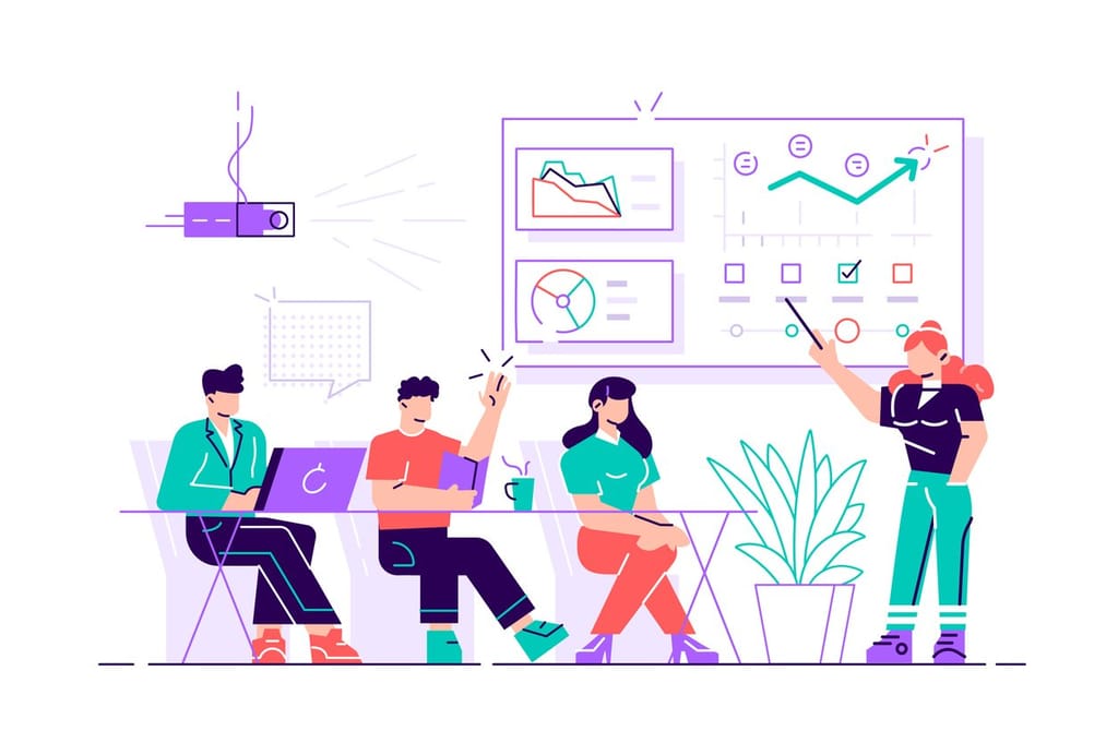
6 min read StatusCake tells you that something might be broken. Hermes can check whether it really looks broken, decide who should hear about it, send the email, and keep the record for tomorrow morning’s summary.

3 min read The allure of OpenClaw is undeniable. You deploy a highly autonomous, self-hosted AI agent, give it access to your repositories and inboxes, and watch it reason through complex workflows while you sleep. It is the dream of the ultimate 10x developer tool realized. But as any veteran DevOps engineer will tell you: running an LLM-backed
7 min read There are cloud outages, and then there are us-east-1 outages. That distinction matters because failures in AWS’s Northern Virginia region rarely feel like ordinary regional incidents. They tend instead to expose something larger and more uncomfortable: too much of the modern internet still behaves as though one place is an acceptable concentration point for infrastructure,
7 min read Artificial intelligence is making software easier to produce. That much is already obvious. Code that once took hours to scaffold can now be drafted in minutes. Boilerplate, integration logic, tests, refactors and small internal tools can be generated with startling speed. In some cases, even substantial pieces of implementation can be assembled quickly enough to
10 min read Whilst AI has compressed the visible stages of software delivery; requirements, validation, review and release discipline have not disappeared. They have been pushed into automation, runtime and governance. The real risk is not that the lifecycle is dead, but that organisations start acting as if accountability died with it. There is a now-familiar story about
4 min read How AI Is Shifting Software Engineering’s Primary Constraint For most of the history of software engineering, the primary constraint was production. Code was expensive, skilled engineers were scarce, and shipping features required concentrated human effort. Velocity was limited by how fast people could reason, implement, test, and deploy. That constraint shaped everything from team size,