
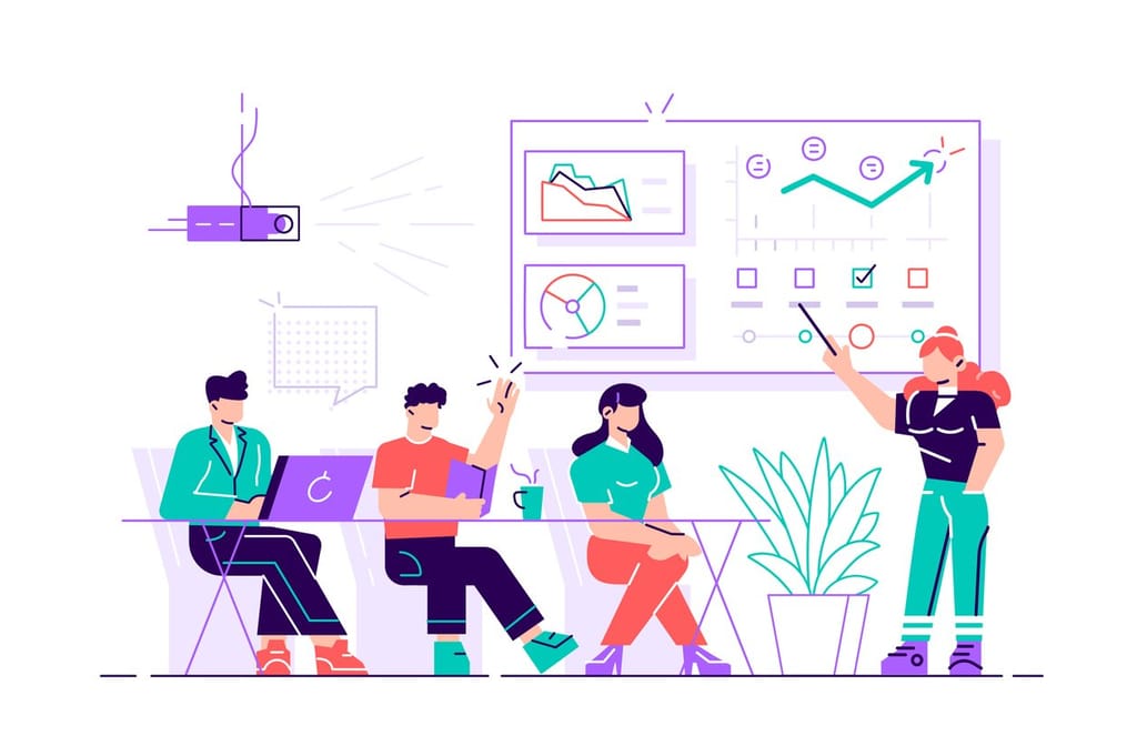
Want to know how much website downtime costs, and the impact it can have on your business?
Find out everything you need to know in our new uptime monitoring whitepaper 2021

The “Corporate States of America” is a map created by writer, photographer and artist Steve Lovelace. His project, which shows the most famous brands to have come out of 50 US states, has got plenty of people talking – mostly about whether or not the brand he’s picked is the right one. For instance Apple is the brand chosen for California, but why does Apple make it to the top ahead of Google and Facebook?
Lovelace created his brand-map after writing an article on “corporate feudalism.” He believes that as companies grow ever bigger and more influential, that the power of government becomes less and less relevant. He suggests for instance that people will come to think of themselves as citizens of Apple for example.
The map also perhaps highlights that not all states are born equal. Whereas some states such as Alaska and New Mexico have few big companies, others such as California as noted above, are inundated with them. Of course this disparity is much to do with established networks and hubs – the availability of finance, staffing and location of a particular state.
In creating his map Steve Lovelace has also not necessarily used the biggest company within a particular State. For instance in Texas, the home of the oil industry, he chooses Dr. Pepper instead of perhaps the more obvious ExxonMobil.
James Barnes, StatusCake.com

Share this
5 min read AI Has Made Building Monitoring Easy. It Hasn’t Made Owning It Any Easier. A few months ago, I spoke to an engineering manager who proudly told me they had rebuilt their monitoring stack over a long weekend. They’d used AI to scaffold synthetic checks. They’d generated alert logic with dynamic thresholds. They’d then wired everything
3 min read In the previous posts, we’ve looked at how alert noise emerges from design decisions, why notification lists fail to create accountability, and why alerts only work when they’re designed around a clear outcome. Taken together, these ideas point to a broader conclusion. That alerting is not just a technical system, it’s a socio-technical one. Alerting
3 min read In the first two posts of this series, we explored how alert noise emerges from design decisions, and why notification lists fail to create accountability when responsibility is unclear. There’s a deeper issue underneath both of those problems. Many alerting systems are designed without being clear about the outcome they’re meant to produce. When teams
3 min read In the previous post, we looked at how alert noise is rarely accidental. It’s usually the result of sensible decisions layered over time, until responsibility becomes diffuse and response slows. One of the most persistent assumptions behind this pattern is simple. If enough people are notified, someone will take responsibility. After more than fourteen years
3 min read In a previous post, The Incident Checklist: Reducing Cognitive Load When It Matters Most, we explored how incidents stop being purely technical problems and become human ones. These are moments where decision-making under pressure and cognitive load matter more than perfect root cause analysis. When systems don’t support people clearly in those moments, teams compensate.
4 min read In the previous post, we looked at what happens after detection; when incidents stop being purely technical problems and become human ones, with cognitive load as the real constraint. This post assumes that context. The question here is simpler and more practical. What actually helps teams think clearly and act well once things are already
Find out everything you need to know in our new uptime monitoring whitepaper 2021